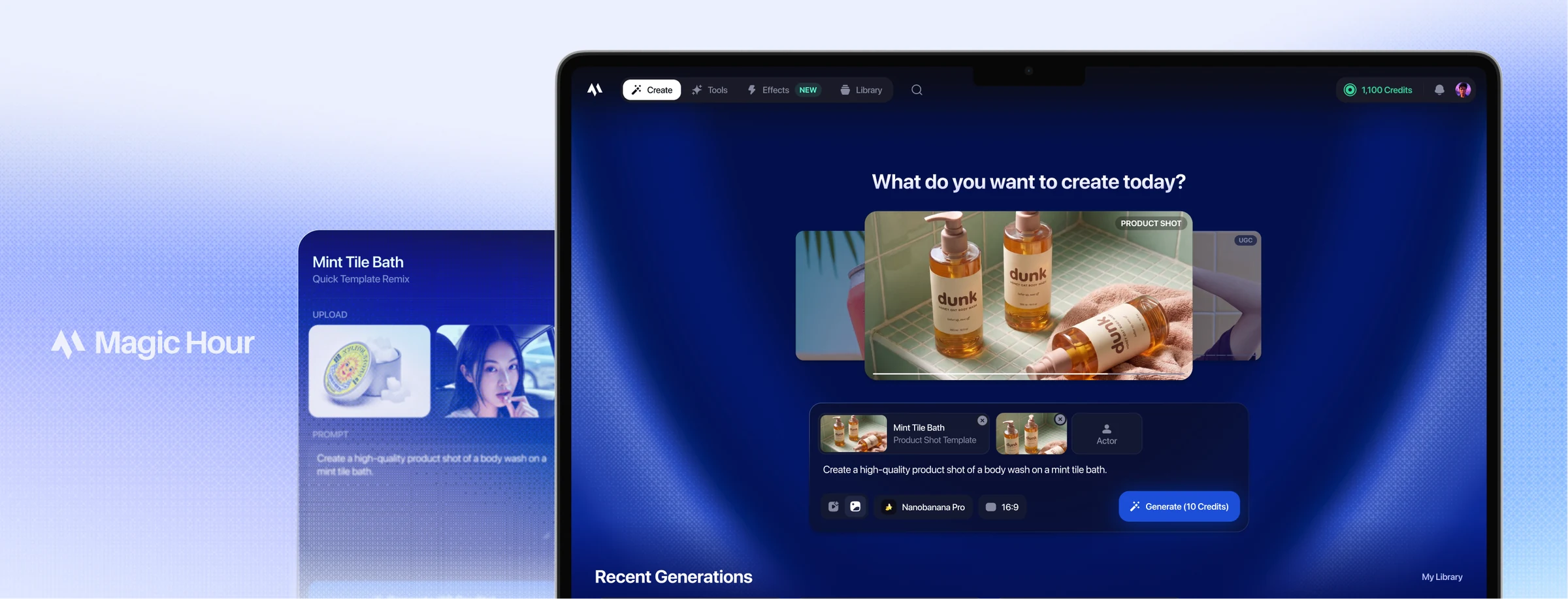
Magic Hour Marketing Studio: Designing a Unified Experience for a Growing Creative Toolset
[case study in progress]
Context
Magic Hour is an AI creative platform with a growing library of image and video generation tools.
Problem
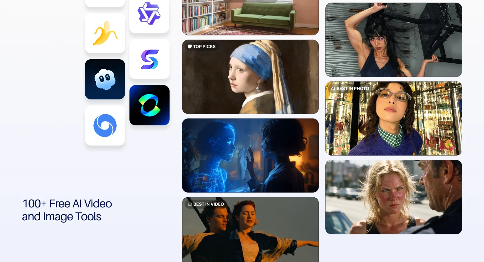
Magic Hour had 100+ tools but no guidance on which one to use.
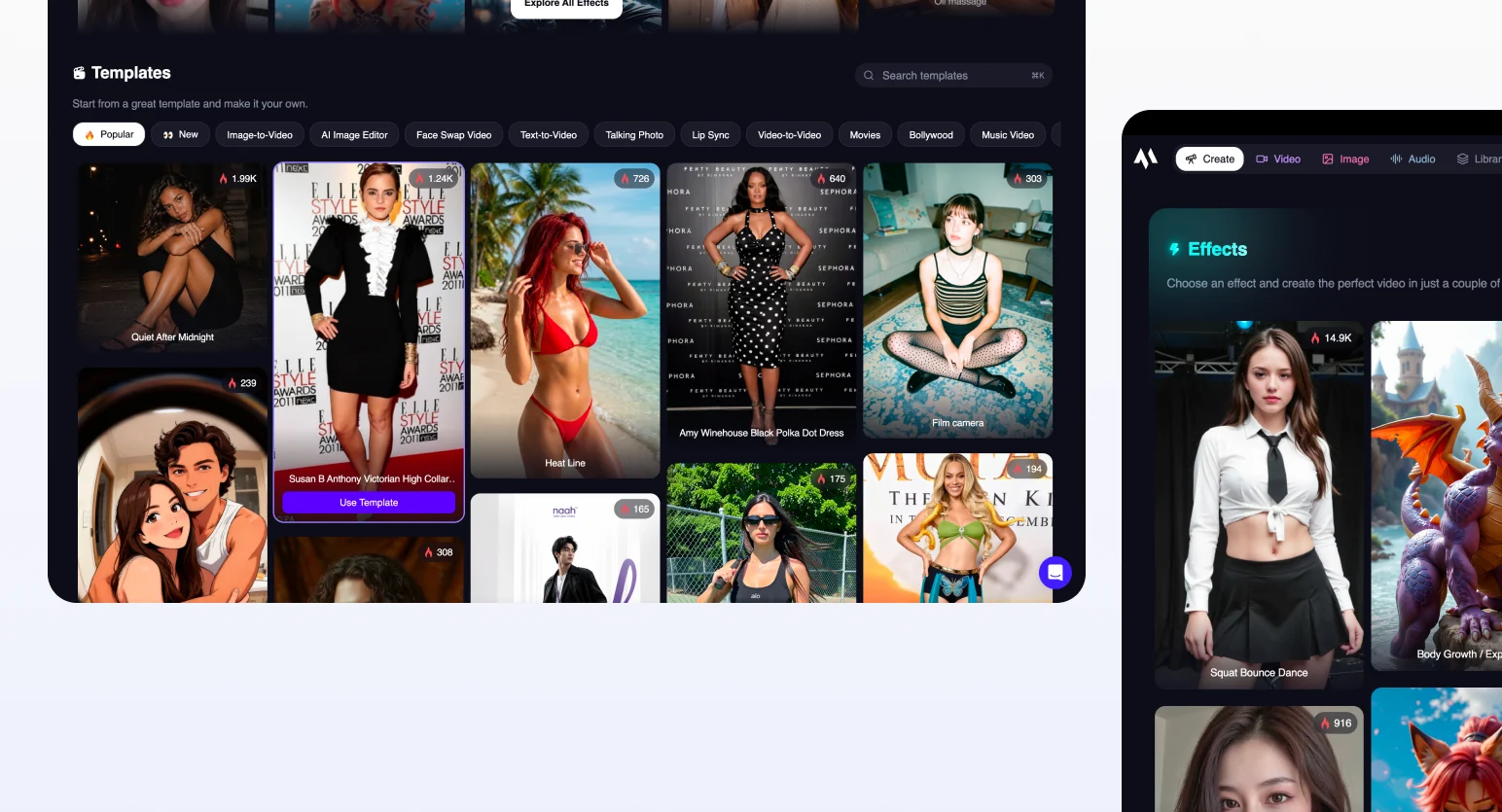
The create page pushes popular tools and trending templates to drive generation, but this hasn’t worked: only 2.40% of generations used the template entry-point over a 30-day testing window.
As the Product Design Intern, I was brought on to design Marketing Studio, a new feature for creating marketing-related content that brings individual tools into a single guided workflow, aimed at surfacing clearer, more useful use cases.
How might we guide users to go from an idea to the right tool, without expecting them to already know the library?
Solution
01. Generate directly from a template, or start from scratch
02. Browse Templates by Category
03. Post-Generation Editing
04. Accessible Entrypoint
Research and Direction
Competitor Analysis
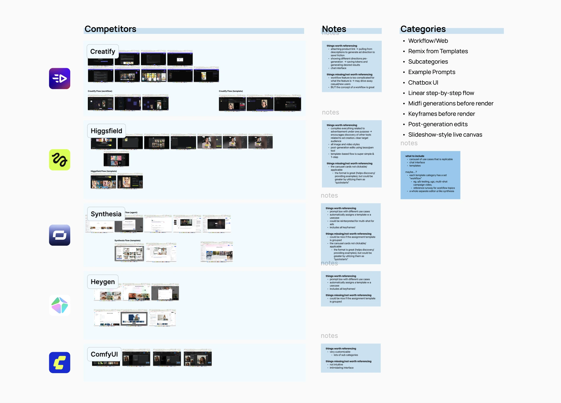
I looked at how competitors approached a similar idea, noting what worked and what could translate to Magic Hour.
Marketing Studio’s Positioning
To see what features could be brought into Magic Hour, I separated out key elements and built a decision matrix using the categories derived from competitor analysis.
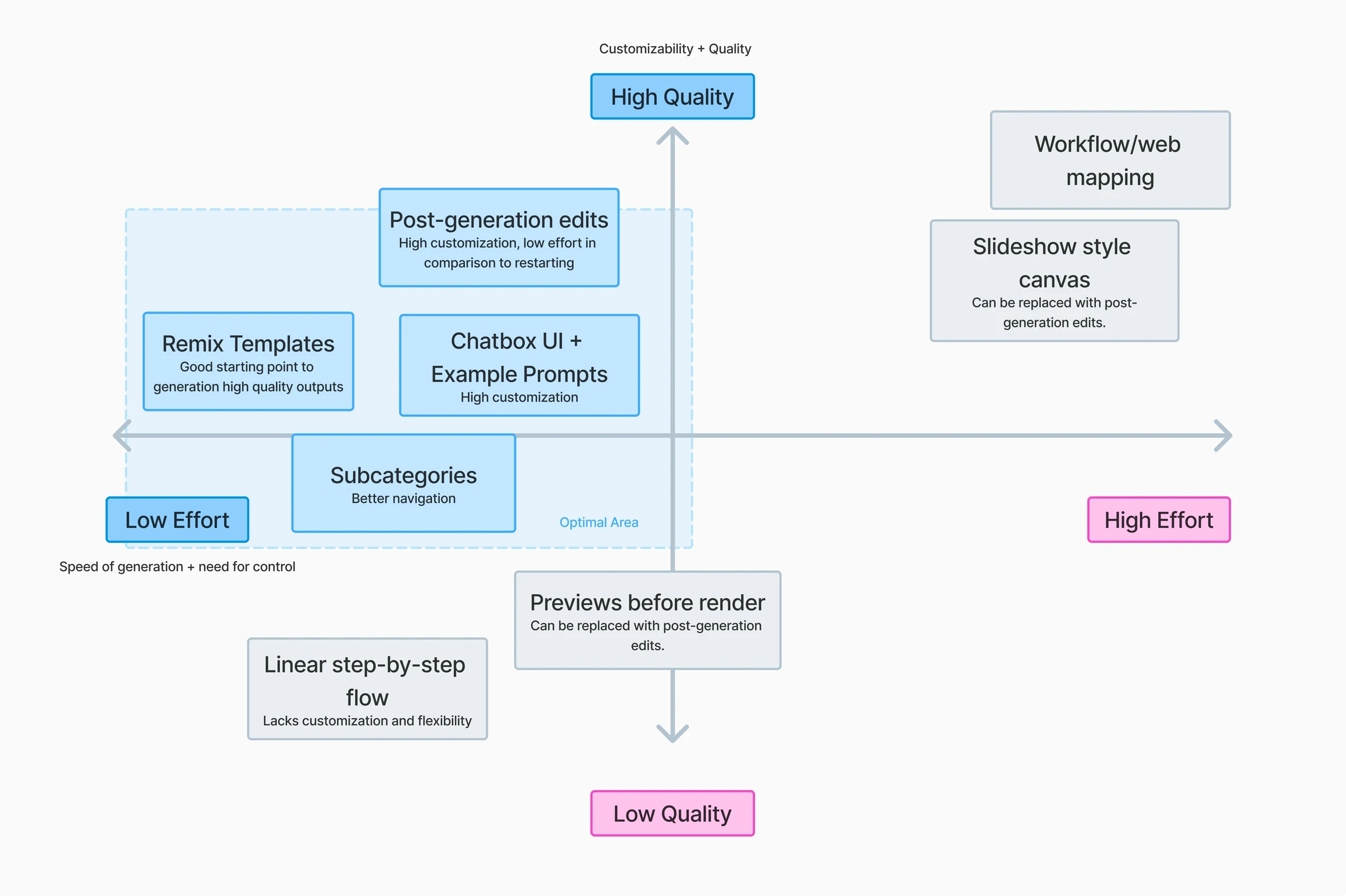
The goal for marketing studio is to create a low effort and high quality experience, meaning quality results quickly. This also meant trading off customization and control.
This direction was designed to reflect Magic Hour’s actual strengths in the market: low-friction entry and free-rolling credits, which attract beginners. Marketing Studio needed to stay beginner-friendly, even if that meant less customization.
Design Decisions
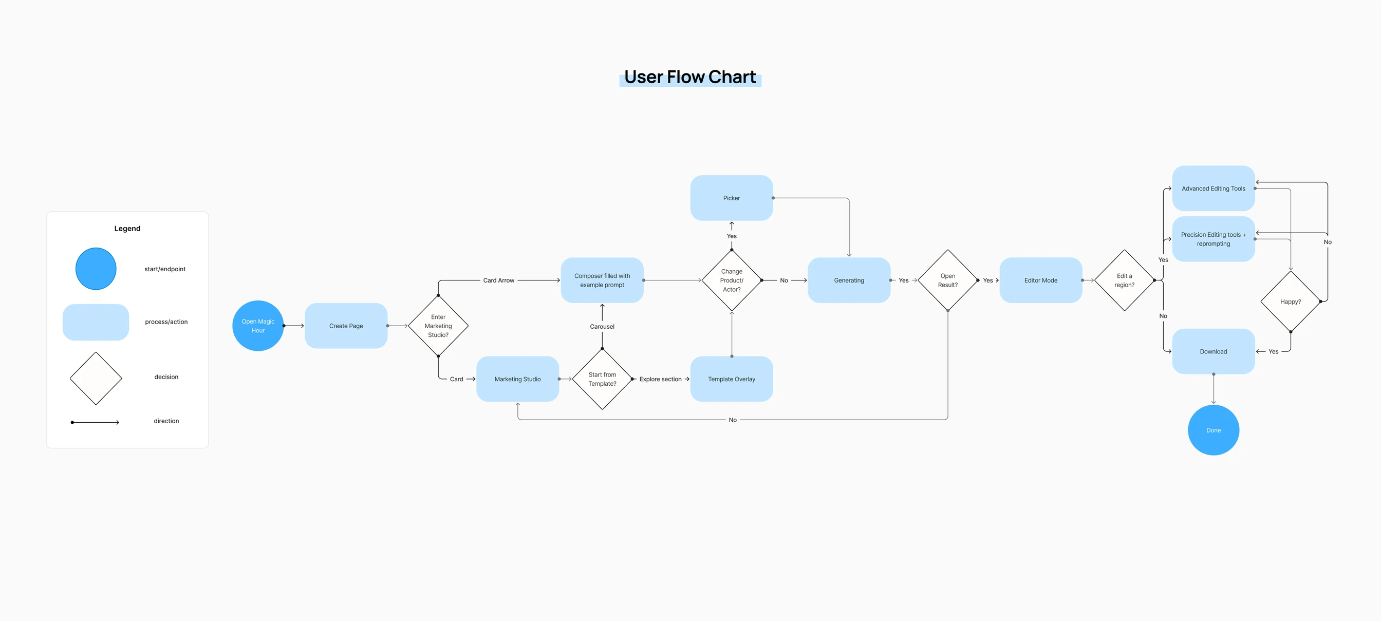
User Flow
Home Screen Explorations
Quick Template Remix Iterations
The Branding Problem
Magic Hour looked like every other AI startup.
While designing the tool, a deeper gap needed to be addressed: Magic Hour had no distinct visual identity, and uses the same purple-and-dark palette used across many other AI Startups, costing distinction in the market. Early on, I pushed for a stronger branding, but a full rebrand wasn’t something the founder thought was worth committing to, especially without an in-house designer to carry it forward.
Marketing Studio became a testing ground for a stronger visual identity.
I proposed a smaller test: a polished visual system built into Marketing Studio, using colors close to its current design system blend into the existing frameworks.
Scaling for the future
I also built an internal tool that applies a consistent shader and gradient treatment to any image or video in Magic Hour’s brand colors, so the idea could scale past one feature.
Seeing the visual direction physically shipped over simply pitching it helped to open up more serious reconsideration of Magic Hour’s broader branding.